
AppSource visual
Alluvium OEE Gauge
A free Power BI custom visual for plants that need overall equipment effectiveness on the page. It shows Availability, Performance, and Quality. It does not ask for another spreadsheet or another vendor dashboard.
What it is
OEE (overall equipment effectiveness) is the product of three rates: Availability, Performance, and Quality. Plants use it to see whether a line ran when it should, ran at the speed it should, and made good units.
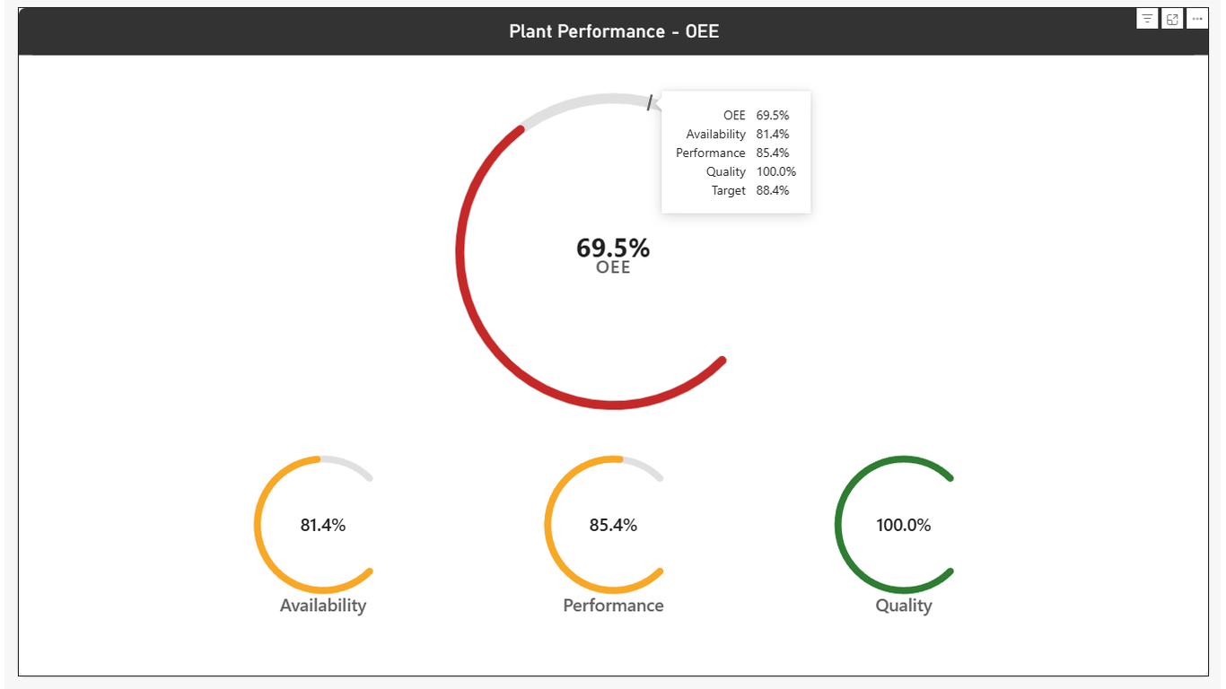
Alluvium OEE Gauge puts that composite score — and the three drivers behind it — into a Power BI visual built for production, maintenance, and ops leaders who already live in reports. Bind your measures, set a target if you use one, and publish with the rest of the model.
Features
Target bands on the OEE arc
Mark the threshold that matters on the plant floor so operators and supervisors see status at a glance — not just a raw percentage.
Availability, Performance, and Quality gauges
Show the three OEE drivers beside the composite score so teams can see which lever moved the number.
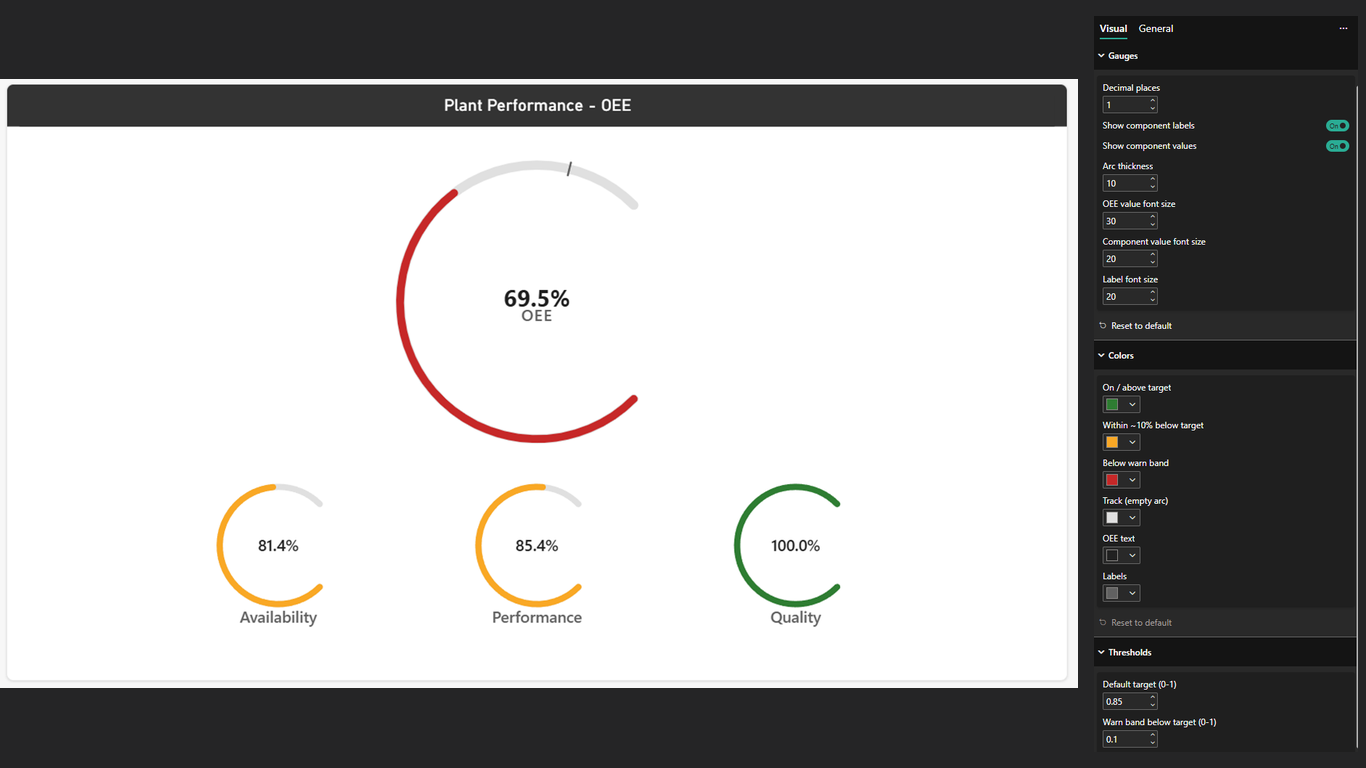
Format pane control
Colors, thresholds, and decimal places live in the standard Power BI format pane — no custom scripting required.
No network calls
The visual computes from the fields you bind. It does not call external services or phone home.
In the report

Data roles
Map measures you already have. A typical manufacturing model already exposes these rates.
| Field | Required | Notes |
|---|---|---|
| Availability | Yes | Numeric measure or column, typically 0–1 or 0–100. |
| Performance | Yes | Numeric measure or column for rate vs. ideal cycle. |
| Quality | Yes | Numeric measure or column for good units vs. total. |
| Target (optional) | No | Optional target for the OEE arc tick / band. |
How to get it
- Open Power BI Desktop, or the service visual marketplace where custom visuals are allowed.
- Prefer the Marketplace listing, or in Desktop use Get more visuals → search Alluvium OEE Gauge (in-product gallery can lag the Marketplace page by 10–14 days).
- Add the visual to the canvas and bind Availability, Performance, and Quality.
- Set colors, thresholds, and decimals in the format pane. No network configuration is required.
Live on Marketplace. Get Alluvium OEE Gauge on AppSource. The in-product Get more visuals gallery can take 10–14 days to catch up after the Marketplace page goes live.
Next step
Book a Session
Need OEE wired into a trusted semantic model — or help rolling the visual into plant reports? Tell us what the line needs to show.